Every single day we get asked questions about the printing process and design considerations. From “Will this logo work?” to “How fast can we get them?”, we attempt to provide the advice that will make your project a success. Below are a few tips that you may want to consider:
#1) When beginning your project, don’t hesitate to contact us and ask about specifics. Whether it’s design format or the style of garment you need, a little information in advance can save you (and us) some time and creative energy. (See our general information section for more details.)
#2) Plan ahead and get on our production schedule. We make every possible effort to meet any reasonable deadline. In extreme cases, a rush fee will incur. In extremely extreme cases, we will not be able to fit you into our schedule. (As much as we’d like to do otherwise, we must adhere to the principles of physical reality.) Especially in the spring and fall rush seasons, it’s best to call ahead to let us know your plans.
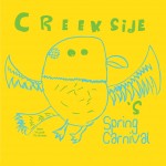
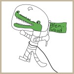
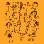
#3) Kids are great designers. To us, there is nothing more satisfying than seeing a young artist’s work on a t-shirt. We have printed thousands of items for pre-school and elementary school projects that featured artwork prepared by students. If this applies to your group, give a youngster a chance to become a designer. They never fail to gladden and amaze us with their creativity.
#4) Consider the shirt color your design will be printed on. If possible, incorporate this “background” color into your design. This can save money on both printing and set-up fees. Utilizing the shirt can also help you avoid large, solid areas of ink, also known in printing circles as a “bullet-proof vest.” This can be hot and uncomfortable for the wearer. In the same vein, think about the ink color(s) to be used. If not considered in advance, projects can end up with tonal conflicts between shirt and ink colors that can cause your eyes to react in an unpleasant manner. (This results in something our co-worker from Rhode Island called ‘da burnin’ of da retinas.’)
#5) Remember it’s a t-shirt, not a piece of paper. In many cases, t-shirt designs look stiff because they adhere to the imaginary “borders” of a page or poster format. The maximum area per placement is 13×13 inches. When applicable, we can use multiple placements on the shirt to achieve to the look you want. Keep in mind that your design is actually wrapping around a human body and thus can be more free-flowing. (We also have cautionary tales…design elements that fall on sensitive areas of the anatomy can look very awkward if not caught in the planning stages of the design.)
#6) Designs should be read from a distance. It is very easy to clog up a good design or t-shirt with too many words. It’s also not fun to have a random stranger get into your personal space trying to read your t-shirt. T-shirts are not books, so try to keep your quotes and phrases short and direct.
#7) If your project requires a wide range of shirt sizes (for example, a family reunion), the design should be suitable for all shirt sizes. In most cases, we recommend a size that will accommodate everything, but occasionally clients wish to have a larger image on the adult shirts and a smaller one on youth or toddler. This can be accomplished as long as each set meets the minimum quantities. (Please see our General Info section.)
#8) Thou shalt not steal. We are often called upon to reproduce images that are copyright protected, including licensed trademarks of UNC and other local universities. (While fans of cleverness and parody, we frown on infringement.) We are licensed to print for departments and officially-recognized student groups at UNC. All designs submitted to us are sent to a campus representative of the Collegiate Licensing Company for approval before production begins.


